Traffic in Atlanta
Traffic in Atlanta
CS6730 Data Visualization Project

ATLANTA, Georgia's capital, home to over 500,000 people, is known for its challenging traffic. Major highways like I-285, I-75, I-85, and I-20 frequently experience congestion, especially during peak hours.

In 2022, the INRIX Global Traffic Scorecard placed Atlanta 10th across the entire country, with drivers losing an average of 53 hours to delays. The city's traffic congestion is a significant concern for residents, commuters, and policymakers.

This project aims to provide insights into Atlanta's traffic patterns, helping residents make informed decisions about their daily commutes and travel plans.

Overview

Interactive Map

This interactive map shows several traffic sites in Atlanta. You can explore the traffic patterns and congestion levels at different times of the day.

Click on the "▸" markers to view detailed information about these sites hourly!

Vehicle Distribution

This visualization provides insights into the distribution of vehicles on the road. Explore different vehicle categories and their respective proportions to better understand traffic composition.

Road Capacity

Different sites have various capacity. This visualization helps you figure out which sites remains smooth even when large flow is going through, and which sites, on the contrast, suffered from traffic jams.

Note: The value of the Speed Index is computed with the following equation.

\( \frac{\text{Current Speed} - \text{Speed Limit}}{\text{Speed Limit}} \)

If Speed Index < 0, the traffic is slower than the speed limit. If Speed Index> 0, the traffic is faster than the speed limit.

Driving Difficulty

Driving among heavy traffic or with large trucks around could be hard and stresssful. With these two factors, this visualization gives people a picture about if a site is more difficult to drive through, which could be helpful especially for new drivers.

Client Scenarios

John: Traffic Volume

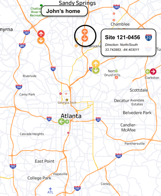
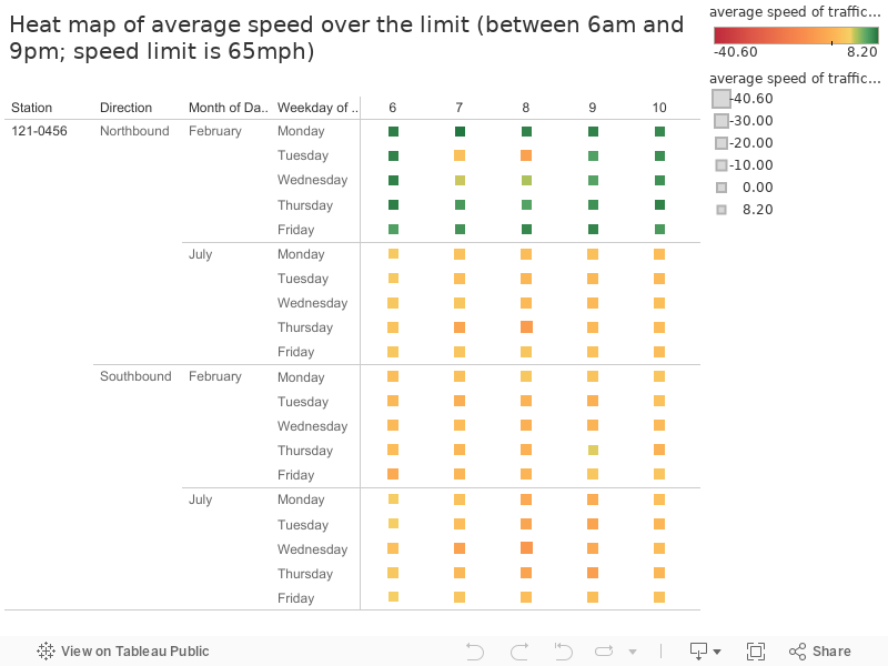
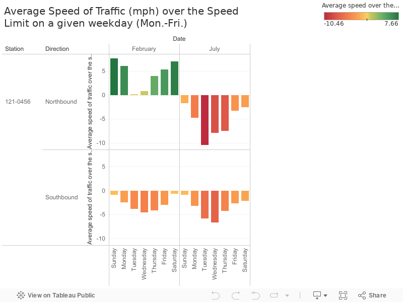
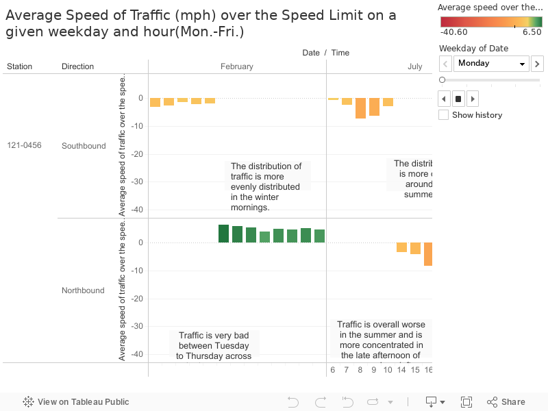
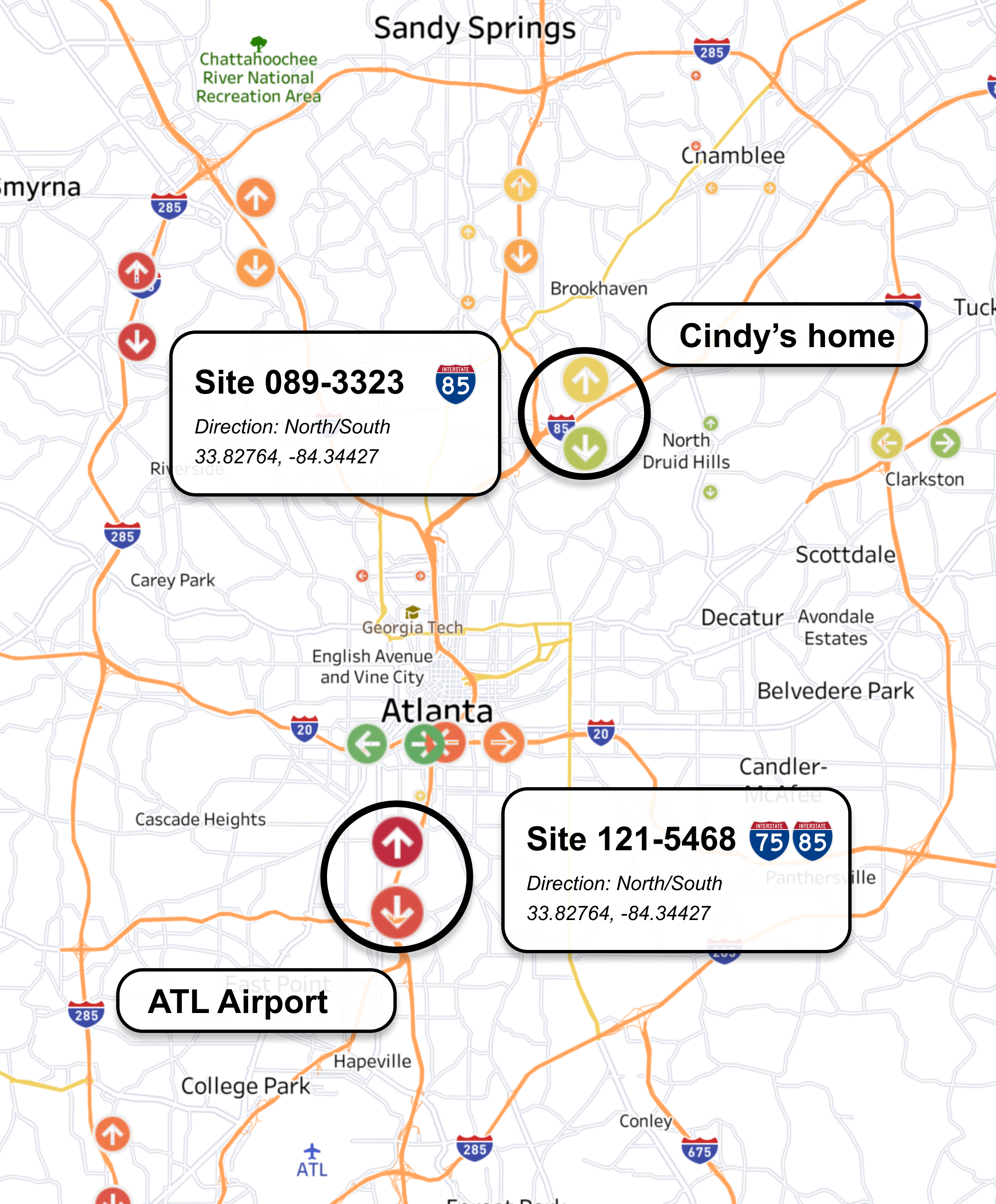
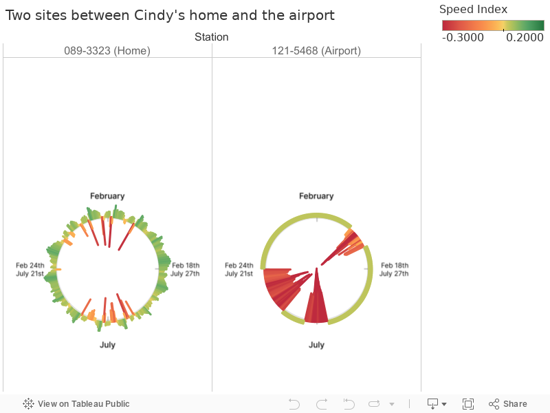
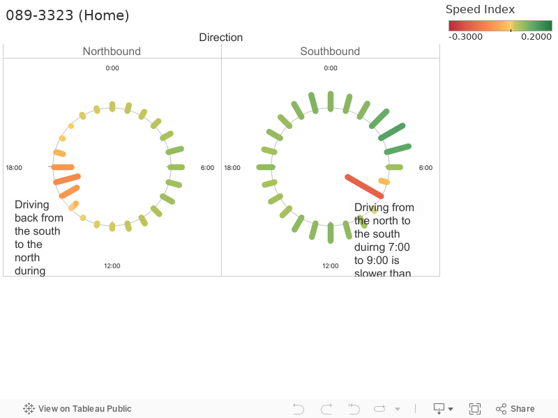
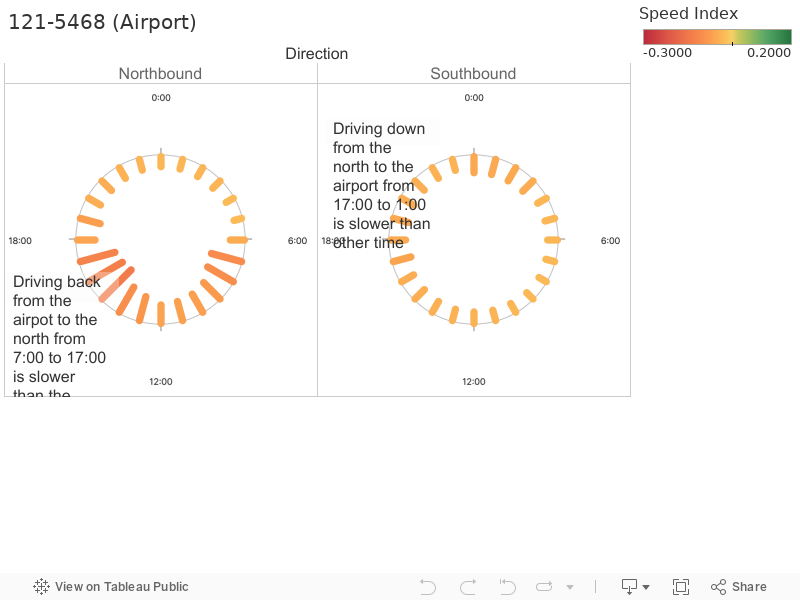
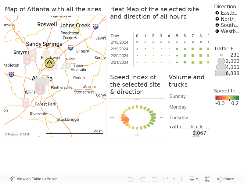
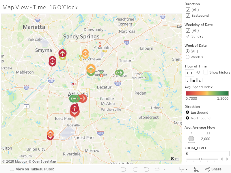
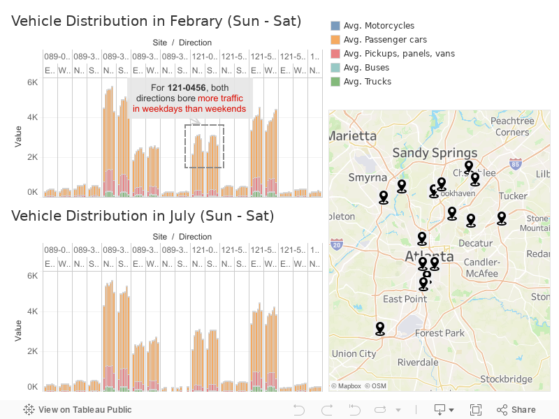
The first client is John. John is an office worker who recently moved to the Sandy Springs area. He works a typical office 9-5 job in Midtown Atlanta. He sometimes has over-time as late as 8pm on rare occasions. He doesn't have kids, so doesn't have to worry about dropping off kids to school. He travels Southbound in the morning to get to work in Midtown Atlanta, and travels Northbound in the afternoon to go back home. He is interested in seasonal data too, because he has to drop off his kids to elementary school and thus leaves early in February, and leaves later in the summer when there is no school because of summer break. He wants to understand the traffic of one particular site, which is a freeway that he uses that merges to where he drives to get to work and back home.

example image
Traffic site visualization

This map shows the intersection where John lives near. He wants to monitor the traffic of this particular site because it is roughly equi-distant to where he lives and where he works.

This view shows a heat map of how slow traffic is relative to the speed limit on a workday weekday (Monday through Friday). The number represents the average speed of traffic above the speed limit (65mph). Green encodes that the average speed of all vehicles is going over the speed limit by more green, while red encodes that the average speed of vehicles is travelling under the speed limit. It also shows two distinct months: the average speed of traffic above the speed limit in February and July respectively.

This view shows a trellis plot of bar charts of the average speed of traffic over the speed limit, aggregated on the entire weekday. It goes in ascending order by day, so Monday is the leftmost bar and Friday is the rightmost bar in each month. Northbound is going home, and Southbound is going to work. So according to this view, John can take away that there is less traffic flow overall in February. It is much worse to go back home (northbound) in the summer as compared to winter. He can also take away that Tuesday through Thursday overall has the worst traffic flow, regardless of particular seasonal month.

This view shows an animated bar chart of the same data, where the animation encodes each frame as one weekday, with the hours listed on the X-axis and average speed over the limit on the Y-axis between 6am to 9pm (or 6:00 to 21:00). Note that the hours between 11am to 1pm inclusive (11:00 to 13:00) are excluded because John knows he doesn't plan to drive during those times.

Overall this visualization informed John that it doesn't really matter much when he leaves his house - the traffic on average is similar across both seasons going south-bound between 6am and 10am, although the school season does mean a more equal spread of drivers between 6am to 10am, whereas in the summer people seem to leave slightly later. Traffic going home is the bigger issue. John should take Tuesdays and Wednesdays remotely in both seasons, and if he needs to go to work, he may want to leave at around 2 to 3pm to avoid significant traffic congestion.

Example Image

Cindy: When should I go to the airport?

The second client is Cindy who lives in North Druid Hills. Cindy is a frequent traveler so the traffic conditions between her house and the airport are crucial for her. She needs to figure out when to travel to the airport and get back to decide on her air tickets.

Example Image
Traffic site visualization

This map shows where Cindy lives and where Cindy wants to travel to and from. Two sites are located on the route between her home address and the airport, site 089-3323 in North Druid Hills, and site 121-5468 around the airport. The two sites are selected on the map.

The color encodes the value of the Speed Index.

If Speed Index < 0, the bar is red , meaning the traffic is slower than the speed limit. If Speed Index> 0, the bar is green , meaning the traffic is faster than the speed limit.

This visualization shows the speed by hour of each day for the two sites. Each bar represents the Speed Index of the hour represented, with the length of the bar represent the absolute value of the Speed Index. The top half circle is the Speed Index of the week of February, while the bottom half circle shows the Speed Index of the week of July. For site 121-5468, there are some dates with missing data.

In general, the traffic situation around her home at site 089-3323 is better than that around the airport at site 121-5468.

This visualization shows the average speed by hour of the site 089-3323 in both directions in the 24-hour clock. Each bar represents the Speed Index of the hour represented. Northbound is traveling from the airport back home, while Southbound is traveling from home to the airport.

According to the chart, driving along Northbound (from the airport back home) during 3pm to 7pm is slower than the other time. On the other hand, driving along Southbound (from home to the airport) from 7 am to 9 am is slower than other times.

This view shows the average traffic speed of the site 121-5468 in both directions. Northbound is traveling from home to the airport, while Southbound is traveling from the airport back to home.

According to the chart, driving along Northbound (from the airpot to home) from 7am to 5pm is slower than the other time. On the other hand, driving along Southbound (from home to the airport) duirng 5 pm to 1 am is slower than other time.

Now the result seems to be clear! She needs to avoid 7 am to 9 am and 5 pm to 1 am when driving to the airport, and 7 am to 5 pm and 3 pm to 7 pm when driving from the airport back home!

Therefore, just considering the traffic situation between home and the airport, she decided to travel to the airport between 10 am and 4 pm and travel back after 8 pm.

Example Image

Alex: The Traffic Impact of Trump's Campaign Rally at Georgia Tech

On October 28, former President Donald J. Trump held a political rally at Georgia Tech's McCamish Pavilion. The Georgia Tech Police Department informed the campus community about the expected disruptions, including increased police presence, road closures, and traffic delays. Key road impacts included:

To understand the event's impact, we analyzed Atlanta's traffic patterns on the event day (Oct 28) and the adjacent day (Oct 29). The following animation provides a side-by-side comparison of traffic conditions between these two days.

Diving Into the Data: Traffic Behavior at Key Observation Sites

Site 1: 089-3323 on I-85

We first examined traffic at an observation point on I-85, a major interstate likely affected by the event. Below is a visualization comparing traffic conditions across the event day and the following day.

Traffic site visualization

Key Observations:

Site 2: 121-5505 on I-20

Next, we analyzed another observation site on I-20, a route closer to Georgia Tech and likely more directly affected by the rally.

Traffic site visualization

Key Observations:

Summary of Findings

By combining animation and detailed site-specific analyses, we see how localized measures can effectively manage the traffic impact of large-scale events, ensuring minimal disruption for commuters while facilitating a high-profile rally.

Now explore on your own

You can select a site and direction on the map to explore the speed, volume, and trucks conditions.